Case Study:
Creating Medsinc
Every year, it’s estimated that 6.6 million children under the age of 5 die worldwide. Over half of those deaths are conditions such as pneumonia, dehydration and malaria. These deaths can be prevented, but the problem comes from getting medical attention to the kids who need it.
All across our world there are areas that are underserved when it comes to access to basic medical care. These areas can be anywhere from the urban sprawl of Botswana to the Ecuadorian countryside, to a West Virginian mountain town. In many of these places there's just one doctor for every 20,000 to 100,000 people, and one nurse for every 2,000 to 10,000 people.

This has led in many communities to the adoption of Community Healthcare Workers, people who are part of the community and might not be licensed or highly educated in medicine, but are doing their best to help and to reach those who otherwise would have no access to care. GameTheory partnered with ThinkMD to design an app that would help empower those healthcare workers by giving them a tool to deepen their abilities to diagnose these children in need and enable a path to treatment.
The idea behind the app would be to create a series of questions that healthcare workers would answer. The app would check those questions against a database and a series of algorithms, and then produce a suggested diagnosis for the patient along with next steps to take.
"We wanted to make sure we approached this challenge from the perspective of these community healthcare workers first."
We were very excited to work with ThinkMD on this project, firstly because of the inherent importance of the project, but secondly because of the fascinating design challenges it presented. Medical technology and medical services in general can be fraught with complications, jargon, and any number of other barriers that might prevent an individual from being able to make use of tools and knowledge that can save lives. We wanted to make sure we approached this challenge from the perspective of these community healthcare workers first and made a tool that would really help them do this important work.
We were looking at a number of challenges when we got started:
Communication: Many community healthcare workers have low literacy or don’t read at all. How can we make an app that helps them diagnose kids without relying on medical jargon or even written language when possible?
Platform: How do we make an app that doesn’t rely on smartphone data, internet, or high quality videos?
What Games Do Best: How can we use what games are able to do and think about different kinds of interactions and unconventional user-interface and user-experience design approaches to tackle these challenges?


The first thing we did was dive into our Discovery process. We sat down with the ThinkMD team and looked at the early version of their app that they had taken into the field for testing. They were able to tell us some first-hand experiences about what they’d observed from users in Ghana. This helped us understand not only what the goals and necessary pieces of the app were but also what it’s current limitations were and what restrictions we had on our end as we started to think about how to solve them.
Some interesting findings from the ThinkMD team on their early versions of the app includes:
Less Lists
Unsurprisingly putting a big list in front of someone and asking them to “click all” that apply doesn’t always get the best results. Often people will read the first few options, then glaze over the rest. It’s not because they don’t want to pay attention, it’s just hard sometimes to carefully think through twenty options at once.
Paralyzing Binaries
Sometimes forcing people to pick “yes” or “no” can lead to more problems than it solves, you feel forced to make a choices even when you’re not sure. Those choices impact the algorithm powerfully.
Visuals Are Vital
Visuals play a huge role in allowing people to understand various medical conditions, but they are also very tricky. Confusing pictures or videos can lead to more problems then they solve, so we knew that we needed a way to get this right.
Clear Results
The end result of their initial prototype was a big wall of text which was trick to digest and make actionable for the community care providers.
Set Expectations
Many apps struggle here but it is critical to game design - you have to clearly communicate to someone where they are in a process and how close they are to their goal. This enables focus and better attention to each step which is critical.
Tricky “Mechanics”
Parts of the prototype asked people to record a heart-rate or a breathing rate. Those measurements presented more technical challenges and were dependent on training and metric tools which limited users.

Flow and Focus
A key part to our design work with the ThinkMD team was promoting a sense of flow and focus within the application. This is an example of something that games do a great job with: they show you your goal, they show you the steps, they let you take things one moment at a time, and they present your result. It might sound like these are easy boxes to check, but oftentimes these types of tools aren’t included, and it’s a little more complicated than it sounds to get right, especially outside of a game.
"Games show you your goal, they show you the steps, they let you take things one moment at a time, and they present your result."
One of the things we wanted to address first was the ability for people to enter the best possible information into the app, addressing ThinkMD’s observation that people sometimes glazed over certain answers. The solution: add more questions!
This might seem counterintuitive, aren’t more questions bad? No one likes to have their time wasted. That’s exactly right, people don’t want their time wasted, and often times asking someone to read a list of 10 things on one page will take them much longer than reading than pages with only one thing. Not only that, if you want someone to read and understand ten things on one page, that will be much harder than being asked to understand one thing on ten pages. Spreading the questions out gave them room to breathe and room to consider. It also makes you feel active. You’re making progress. You’re moving forward! It feels better to be whipping through questions then having to sit on one page and carefully tap through each option.

However, this comes with the important design challenge of also making sure they are the right ten questions. We worked with the ThinkMD team to reword and adjust many of the questions to get only the critical information into the app, including designing a flow where “filtering” questions are asked first, that way certain questions later don’t have to be asked at all if someone said “no” or “yes” to specific options at the beginning. Another key part of the process was ensuring that in all languages there were only 3-4 “answers” and two lines of text to “questions”. This was so important because we had to ensure that questions, answers, and any visual content could be seen without scrolling even on very small devices.
"When you don’t have a sense of predictability, of what the experience is going to ask of you, you don’t know what to expect from it and that distraction takes away from the goals of the app."
Another key to making people feel a sense of progress and control in the app was dividing the questions up into clear sections and adding a progress bar. This let people feel like they were checking off one box at a time and moving forward towards a predictable end-point. It might not seem critical to add things like this, but when you’re going through a diagnosing process, constantly wondering “is this it?” “how many more questions?” “I wonder if I’ll have time to see my next patient?” that’s a distraction. When you don’t have a sense of predictability, of what the experience is going to ask of you, you don’t know what to expect from it and that distraction takes away from the goals of the app. It’s easy enough to break down the content into bite sized pieces that feel like rewarding milestones towards the end of your experience.
Critical Visuals
Visuals played a major role in designing Medsinc. We were designing this tool for a low to no literacy population, and asking them to do assessments that are often only saved for highly educated professionals. Visuals were the key to making this app accessible to anyone and therefore powering its success.
We considered a number of options, including photos and videos, but videos take up a lot of space and require some futzing to get into the HTML5 format. Pictures can be good, but often are confusing or unclear, not to mention challenge to get a hold of.
In the end we decided to go with illustrations and GIFs to serve as companions to each question. Illustrations provide a lot of flexibility that photos do not, and they can be edited with far greater ease to feel culturally diverse and representative as well as clinically accurate. Illustrations can also use tools such as color and emotion to focus the viewer’s attention in ways that language cannot.


Another key part of visuals was the small states and animations that accompanied the entire process. While a “check box” for “yes” and a “x” symbol for “no” might seem like universal symbols, they certainly are not. Many cultures have diverse understandings of symbology and these user-interfaces that are assumed to be common aren't actually universal, nor do they always translate well so we were not able to rely on them.. Color psychology is more clear, but some colors can be very hard to see on a small screen under the bright sun. This all meant we had to be very considerate and focused on the audience first as we created our designs.
We used very clear “down states” on buttons and photos to emphasize the action that users had taken, and allowed people to first “pick” then “confirm” to ensure accuracy and a sense of control. We animated buttons and various components to imply desired actions without words wherever possible.
The end result was an app that was filled with animated visuals and clear directions that even someone who wasn’t literate would be able to navigate.
Make it Easy, Make it Gamey
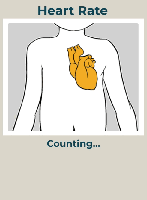
A number of the tools that we added to Medsinc were really just ways of taking a very simple game mechanic and using it to replace a far more complicated “data task” such as entering a heart-rate or accurately determining how much “turgor” someone’s skin is experiencing.
In their testing ThinkMD found that people had a hard time fiddling with the numbers when trying to simply type in an answer to “heart-rate” not to mention, what does heart-rate even mean? How is that number generated? Instead, GameTheory added a simple mini-game where providers tapped a visualization of a heart to make it beat each time they heard their patient’s heartbeat and after a few seconds, the app generated it’s own heart-rate calculation.
We used visuales such as sliders for age, that when manipulated changed the picture of the child shown above to be older or younger.
We used various GIFs to demonstrate conditions, for example, if a user tapped “red and swollen”, the image would change to match, letting people make visual confirmation of their answers before finalizing them.
We also used a game design toolkit to redesign the ending screen. Often times games have to present a lot of information to players at the end of a level, etc. and it’s critical that each piece of information feels clear and understandable. By breaking the end results into columns for “normal”, “mild”, and “severe”, we let people see with visuals that didn’t rely on language what the condition of their patent was and how to address it.


How'd It Go?
With our design phase we were able to mock-up and prototype all of these changes and solutions, iterating on them through real-world demos with the ThinkMD team. Finally, once the design was confirmed, we coded the entire design into HTML5 and plugged in the Medsinc algorithms. The app was ready to go!
ThinkMD took the app within a few weeks of completion to Botswana for testing with results that were a huge improvement from the last round. They brought back lessons and stories that helped the app continue to evolve and serve thousands across the globe.