What Games Are Getting Right About Accessible Design
March 18th 2020, Shannon Mitchell
Designs are only useful when they can actually be used. That’s why when we design, we need to talk about access.
March 18th 2020, Shannon Mitchell
Designs are only useful when they can actually be used. That’s why when we design, we need to talk about access.
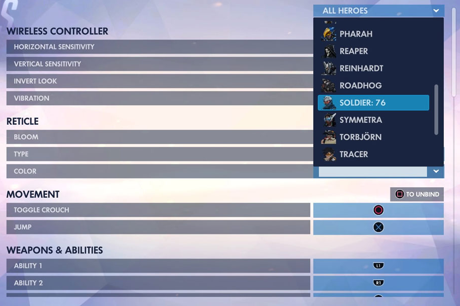
Overwatch aims to give as much control as possible over the experience through options and controller customization.
If you’re anything like me you probably start out a new game by taking a chunk of time to fiddle with the brightness, control scheme, or volume controls to see what settings are available. Unlike your typical applications, most modern games will have dozens of options and toggles to make the way you click, view, and interact fully open to your preferences. Options to adjust contrast, text speed and size, sensitivity, swap color palettes and more have made game customizations more comprehensive than ever. Having all these options lets people use the interface in a way that works for them, rather than making a “one size fits all” system. This customization is really valuable for those with certain types of auditory, visual, and motor impairments because they can set up a custom controller or mouse, and adjust how information is communicated to be more understandable and interactive.
In terms of usability, this is a pretty smart approach. As designers it’s nice to say that we know exactly what is most “user-friendly” but when it comes down to it, most users know what they want and would prefer to pick for themselves. Wouldn’t it be cool if every app you used gave you settings like this?
This is important for more than just the look and feel of a design. Games also look at ways the user can pick their own difficulty, challenge, and speed to adapt a game for their own style. All of these options come down to one big reminder - let people choose what works for themselves! Customization is key.
Here are some industry recommendations for ways to build more choice into your designs:
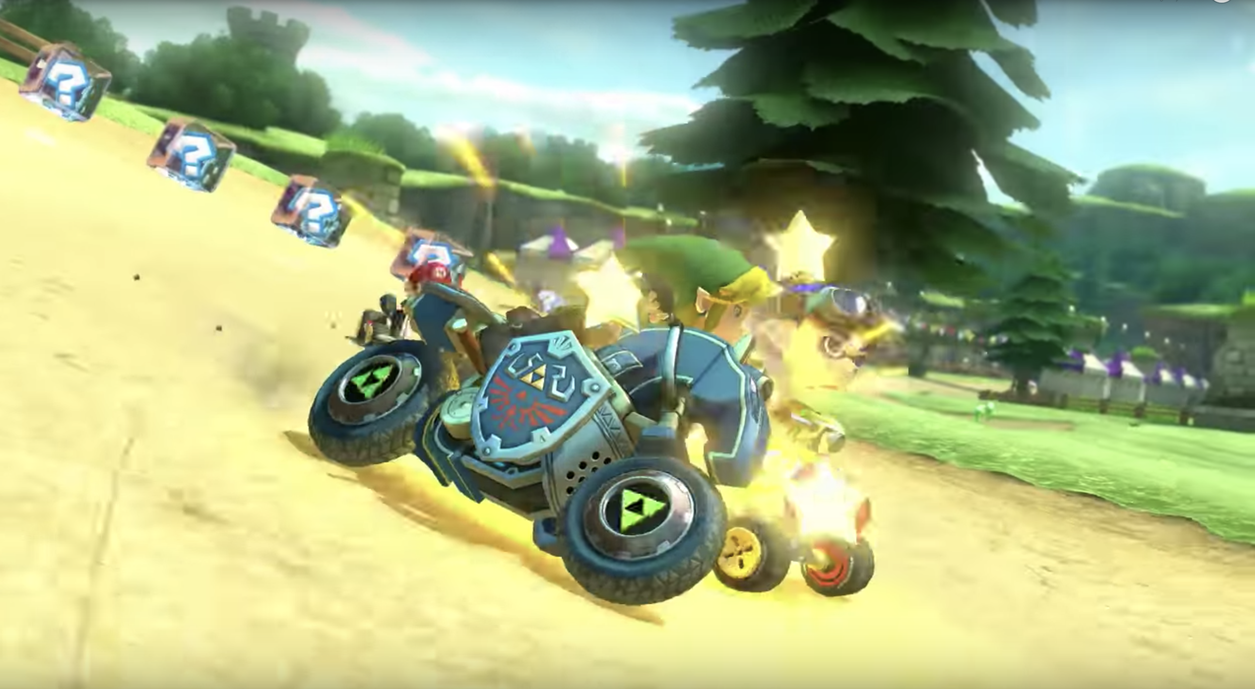
Mario Cart 8 uses UI, visuals, sounds, and haptic feedback to convey what's happening in the game.
Let’s take a minute to think back to the start of your favorite game. I’m sure when you first picked it up you felt pretty lost and confused. To push you beyond those feelings, the game had to take time to break down each important detail to you in a way that was easy to understand. Consider how the game explained the important information to you at this early stage. It may have had on screen instructions, voiceover, effects, or even haptic feedback through your controller to get you to take the right steps. The way most games break down information is by providing multiple channels to help you absorb what’s important. Rather than explaining something once, everywhere you look in the game reinforces the information you need, or the action that’s expected of you.
Let’s take for example a game where you’re getting damaged by an enemy. You’ll probably hear a sound that cues you in to what’s hitting you, you’ll notice your health meter drop, and you’ll see some colors or effects appear on screen showing the severity of the impact. All of these multi-sensory effects are explaining the same information - that your health is being lowered. By layering the senses that are engaged to explain this information, the story is reinforced and more accessible. The story doesn’t rely on the success of one information channel for you to progress.
For design to be accessible, work on using as many channels as possible to tell a story. Never rely on a single color, icon, block of text, or a sound effect to explain what’s happening. You should take time to combine these cues and layer them together, creating options for your users on how to access and absorb the information they need to move ahead. Make everything that’s part of your design repeat, reinforce and prioritize that key information. These paths add depth and cohesion to what you’re explaining and help make sure your users have the tools and information they need to keep making progress.
Here are some industry recommendations on delivering information across multiple channels:
One of my favorite genres of mobile games are one-button games, or games where everything in the game can be done with a single type of interaction. Take Crossy Road as an example - you can walk forward, move, jump, and dodge all using taps. Alto’s Adventure is another fun game where you jump over cliffs and collect your alpacas all by pressing on your phone for each jump. These games are fun because they give you full control and power over your experience with a very streamlined and paired back control scheme. Everything in the game can be reached through the same interaction. It feels light, consistent, and uncomplicated.
Designs can become inaccessible when extra complexity is added to them. One button games are a great example of how you can have a fully interactive, fun experience with simple and memorable controls. Consistency of interaction and visual design can help to reduce the cognitive load that a design requires of a user, and lightweight controls can be effective for the different motor and mobility levels within your audience.
Likewise whenever you design, think about what extra work you can take away from the player. Game designers have been realizing that requiring layers of menus, combo controls, and quick time events may sound fun at first, but when implemented as a requirement can feel tedious at best, and unusable at worst. At the end of the day, try to feel out what will be the most straightforward way to let people get through your design. Think through if it’s really as easy and functional as it could be. If not, see what you can pare back, or better yet, let people have a choice in how it functions for them. There’s always room to grow.
Here are some tips on streamlining your design:

Crossy Road uses tapping to control every part of the game.
These principles will help improve your design accessibility, but know that this is just the tip of the iceberg on how to help your designs reach your audience.
The Game Accessibility Guidelines, is a living document curated and crafted by some of the top accessibility designers in the game industry, and it’s full of resources and advice on building an accessible designs from the ground up. It has tons of examples and weighs the reach, complexity and the impact of each accessibility feature suggested.
I would also recommend looking at free tools like Color Oracle which can simulate common types of color impairment, Contrast for checking, well, your contrast, and The A11Y Project which has resources, repositories, tests and more to help web designers meet accessibility standards.
This is a rich and growing field with new techniques developing every day. Most importantly, remember that even when following these principles, there’s always room to improve. Constantly testing with your audience is the best way to make sure your design is adaptable and improving to better reach people.


